Why do letterforms transport us?
An Interactive Examination of Letterforms and Technology
This book contains the exhibition ABRACADABRA: Letterform, Technology (from the Center for Book Arts) shrunken-down into a handheld size. Designed and printed (on the riso) by Kelli Anderson with a variable type cover, it contains four essays, three playlists, and several interactive components exploring the how the history of typographic technology reflects the culture around it.
- 51 duotone pages
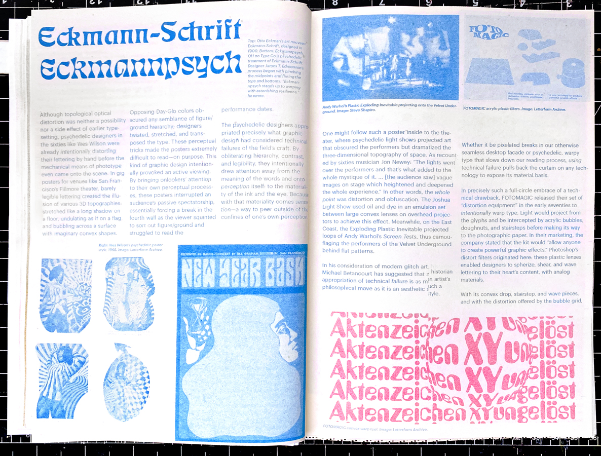
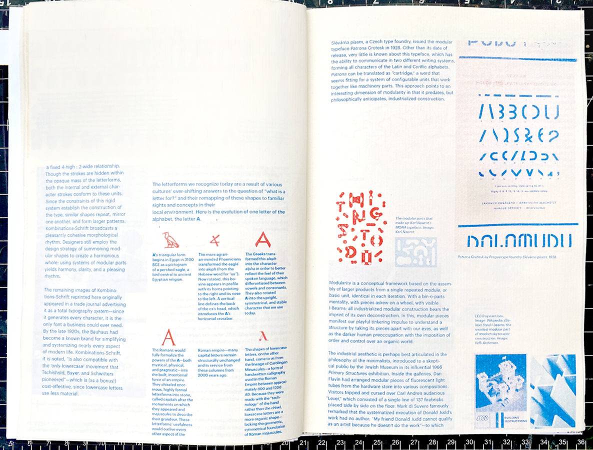
- Includes Letraset Kombinations-Schrift! (Josef Albers' modular typeface)
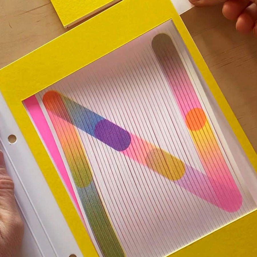
- Includes a light projection stencils to explain Phototypesetting
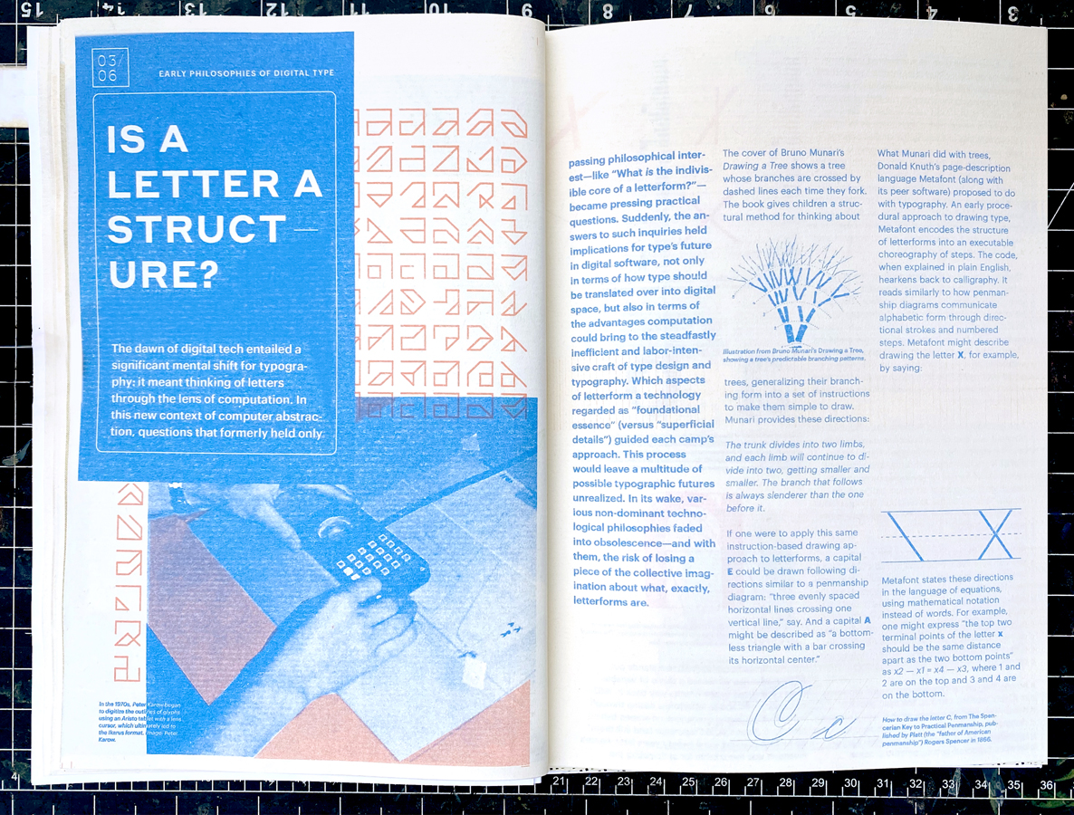
- Includes a screen to demonstrate moire (and the trouble that grids caused early digital type designers)
- The watermarked invitation to the show is included
$50
Typography is a good model for observing perception because, with its strict rules, it creates an artificial laboratory-like workspace that everyone has within his or her reach. The relationship between shape and counter shape, which in writing amounts to the relation between black and white, is the foundation of perception—the interpretation from any sense organ relies on this principle of contrast.
—Gerrit Noordzij
This workbook invites readers into playful dialogue with mysterious dimensions of typographic symbology, technology and their own perception. It does this by presenting technical typographic concepts as toys—with interactive elements, prompts to draw letterforms, and collaborative thought-experiments.
At a mere glance, typography might transport us—the shape of a letter might conjure a debate over anything from aesthetics to philosophy. For example, one might be reminded of the Roman Empire while gazing upon stately uppercase serif letterforms, without realizing why. The first serifs were, in fact, wedge-shaped artifacts—the shape left behind when chisel pummels stone. A serif originated as the mark left by the technology of a ravenous empire.
It is with such an economy of expression that tiny typographic shapes connect us to an aesthetic and emotional experience of history and technology. On every bodega’s awning, post office’s signage, in Microsoft Office and in Google docs, in discarded electronics bins, there are letters embedded with different ideas about what civilization should be. Typography offers us all a handheld play-space to connect to these ideas through our own perceptual sensitivities.